Google · Sampi
Email Campaign Analytics —
UX Copy & Interface Content
Google Product Marketing Managers lacked a central repository for easily storing and viewing creative assets and performance data for their email campaigns. I led content development and UX writing for Sampi — the internal tool that replaced a fragmented, unintuitive system across 44 products.
The challenge
Prior to Sampi (then called eRepo), PMMs used Gamma — Google’s email marketing system — to access email creative assets. It didn’t lend itself to quick, easy, or intuitive access. There was no central performance view, no filtering by product or region, and no way to compare campaigns at a glance.
The brief was to build something that let PMMs ask performance marketing questions by simply using dropdown filters — and get answers immediately, without SQL queries or spreadsheet exports.
The work
250+ Google PMMs needed to search, filter, and analyze thousands of email deployments across 44 products and 74 languages. I wrote the full UI layer: navigation labels, filter dropdowns, sort controls, performance metric labels, threshold messaging, and action copy — all aligned to Google’s style guide.
“8 assets found.” “Group by deployment.” “Download Selected.” Every label earns its place by reducing the decision a user has to make. As Sampi evolved from an email repository into a full performance visualization platform, the writing scaled with it — date range selectors, CSV export flows, country and language filters, and threshold-based color coding that told a story before a PMM asked a question.
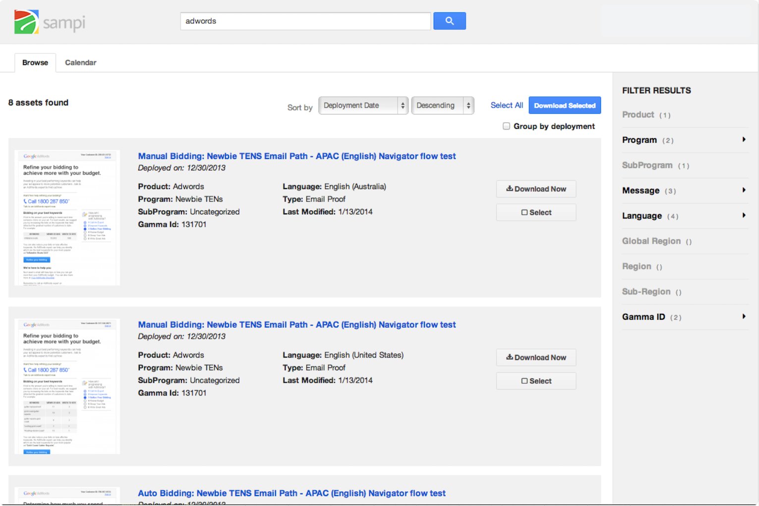
Click to enlarge · Sampi search and filter interface
Impact
One of the main benefits was increased usability — enabling PMMs to ask performance marketing questions by simply using dropdown filters. Conversely, PMMs could ask the app to surface any deployments with open rates under 10% to spot red flags, or click rates over 4% to see higher levels of engagement, simply by using a sliding widget. Thresholds were editable, so users could highlight patterns for an entire quarter and share that particular view via link.